Timmy Shot Me
⬦
Timmy Shot Me ⬦

Project
Overview
Revealing Real Stories
Timmy Shot Me is an ambitious and rebellious video production company that focuses on telling the stories of change makers who are bringing impact to the world.
This is our logo and visual identity proposal for them. It’s a great example of the ‘whole process’ in action.
What We Did
Logo Design
Visual Identity
Brand Guidelines
Logo
Concept
Eyes on the logo
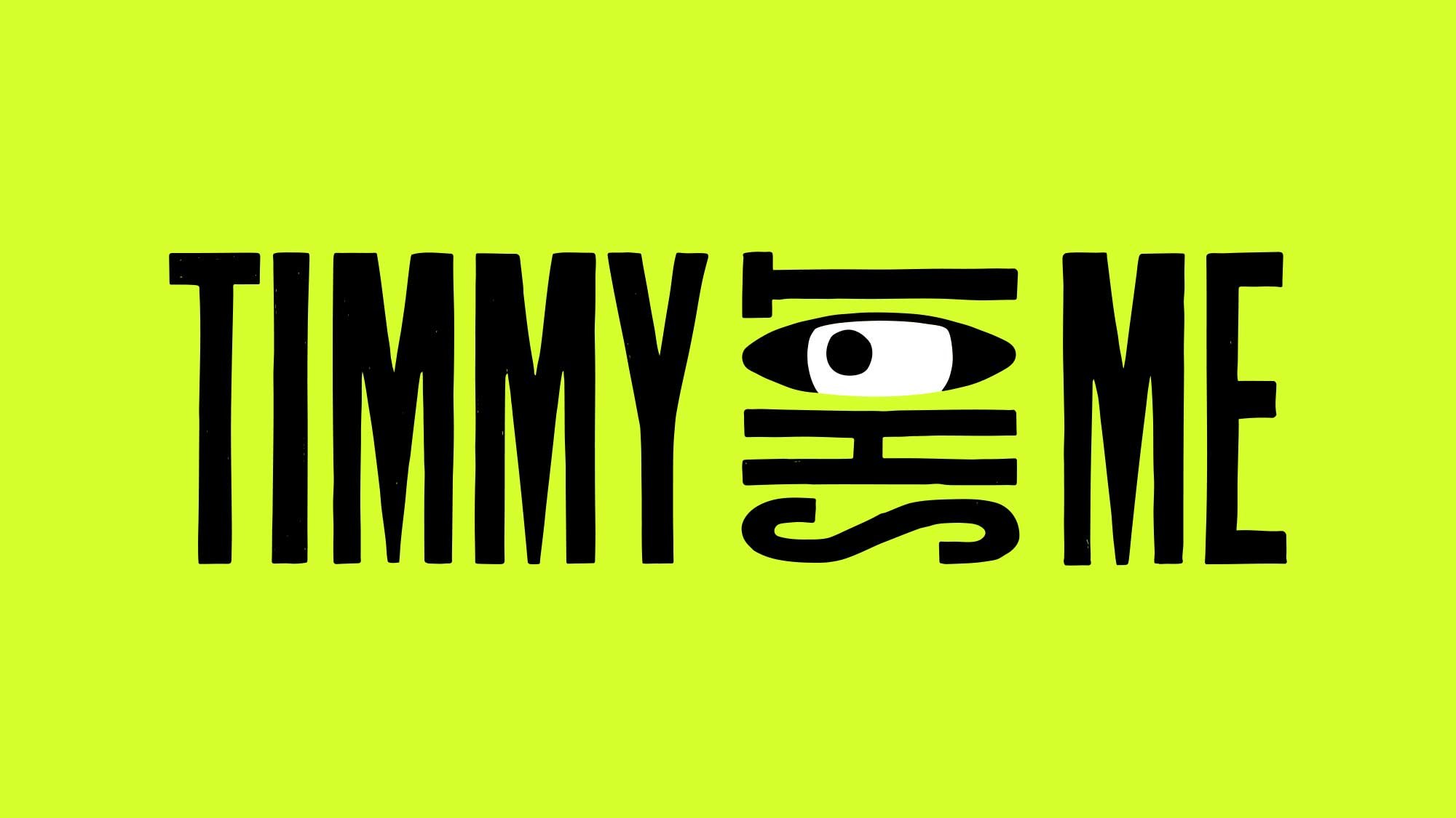
The new Timmy Shot Me logo features hand-crafted lettering and the fun element of an eye as the ‘o’ in shot.
The lettering is crisp but subtly unique, showing the hand-of-the-maker and a rebellious edge. The type is bold and impactful.
The eye represents Timmy’s ability to view a story and add clarity to it. It suggests film making, discovery and audience. Revealing real stories.

Brand
Identity
Covering all the bases
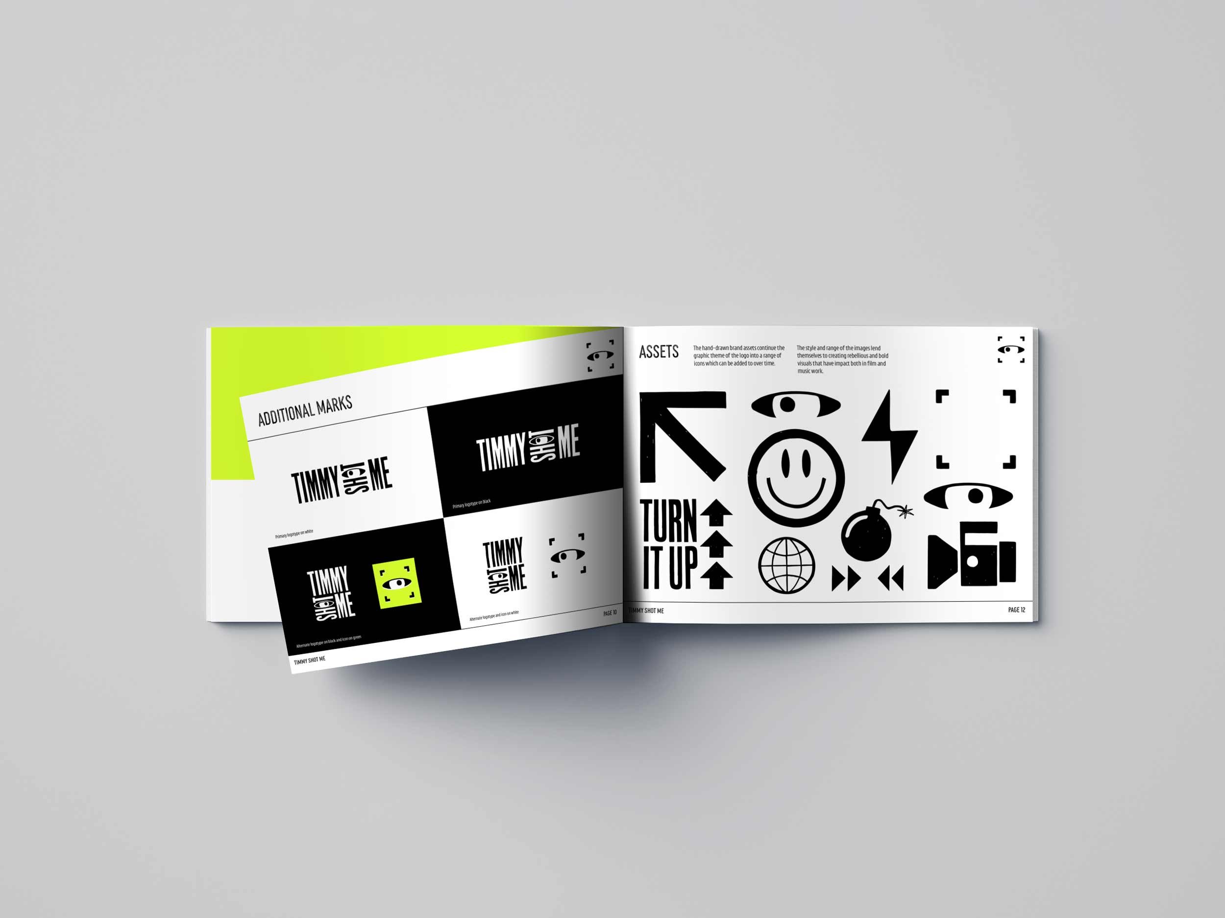
The colour palette and set of assets for Timmy Shot Me were designed to be rebellious and bold for maximum impact in both film and music work.
Inspiration comes from 90’s rave culture in the icon designs and neon colour. Fonts compliment the logo design and add a ‘directors note’ option hand style script for the occasional personal touch.


