Typographic Hierarchy in Graphic Design - the secret-sauce.
Just recently I worked on a project where a company had a document full of important information to convey to investors. The document was busy to look at, slightly confusing, and anything but a joy to read. They sensibly employed our services to fix it and we created a new version of the document that was clear, on brand, easy to read and attractive to look at. We added some real value to their brand by creating a document which was just as professional as the services they offered. They were super pleased with it and were now excited to share it with their clients.
So, this had us thinking about creating a blog about a key aspect of creating visually clear and easy to navigate designs, and that is… Typographic hierarchy.
Typography hierarchy is about the organisation and arrangement of text elements in a design to create a clear and visually pleasing order of importance. It helps guide the reader's eye, communicate information effectively, and create a harmonious and aesthetically pleasing composition. It is one of the ‘fundamental principles’ in graphic design, although we think not too often specifically talked about. It might be the secret-sauce of the difference between an experienced designer and a newbie.
Now you know you need to have a taste of this secret-sauce yourself, let’s look what exactly the key elements are and provide some helpful examples.
The basic Typographic Hierarchy levels
Heading
The heading is the first thing viewers notice, making it the prime spot for your key message. It typically holds the page title and should be visually striking, using large, bold typefaces to grab the viewer's attention and encourage them to engage with the topic of the page.
Subheading
In graphic design, subheadings divide content sections, offering more context than the main header and guiding readers through the text. Subheadings should be distinct from the body text while maintaining a clear connection to the main header.
Body
Body copy carries the main content and should prioritize readability. While headings and subheadings capture attention, the body text's job is to effectively convey information. It's crucial to choose a legible font and a smaller text size compared to headings and subheadings.
Pretty straightforward, but here is where it gets interesting as we look at the different ways that we can create a difference between Header, Subheading and the body copy. This is where the designers secret sauce comes in. We use at least one of these elements for each, but often more.
Key elements of typography hierarchy include:
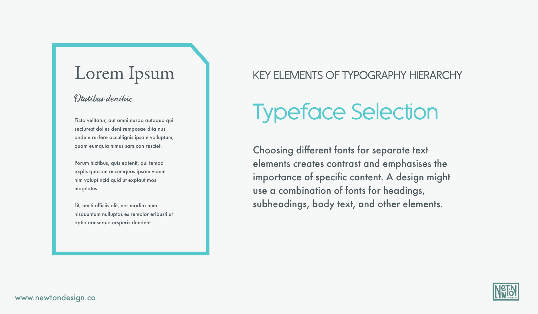
1. Typeface Selection: Choosing different fonts for separate text elements creates contrast and emphasises the importance of specific content. A design might use a combination of fonts for headings, subheadings, body text, and other elements.
2. Font Weight: Varying the thickness of the typeface (bold, regular, light, etc.) helps distinguish between headings, subheadings, and body text.
3. Font Size: Using different font sizes indicates the hierarchy of information. Larger fonts are often used for headings and subheadings, while smaller fonts are used for body text and less important content.
4. Colour: Using colour to differentiate text elements, bold or contrasting colours can draw attention to important information, while muted or complementary colours can be used for less important content.
5. Spacing: Adjusting letter spacing (tracking), line spacing (leading), and paragraph spacing to improve readability and create visual separation between different text elements.
6. Alignment: Choosing between left, right, centre, or justified alignment for text elements, depending on the design and content. Alignment can also be used to convey hierarchy, with centred or right-aligned text often used for special emphasis.
7. Typography Styles: Employing different typographic styles, such as case, italics, underlining to highlight specific words or phrases.
Typography hierarchy is a powerful tool in design because it not only makes content more visually appealing but also enhances the user's ability to understand and prioritise information. By carefully considering the typography hierarchy, designers can guide the viewer's eye, convey meaning effectively, and create a balanced and engaging visual composition.
10 reasons why Typographic hierarchy is important.
Typography hierarchy is crucial in design and communication for several reasons:
1. Clarity and Readability: A well-structured typography hierarchy makes content more readable. It helps viewers quickly identify and understand the most important information, making it easier to navigate and consume content.
2. Emphasis and Focus: Typography hierarchy allows designers to emphasize the key point. By using larger fonts, bold styles, or colour variations, designers can draw attention to specific elements, guiding the viewer's focus to what matters most.
3. Organisation: It provides a logical and organised structure to content. Clear differentiation between headings, subheadings, and body text helps users scan and find the information they need without getting lost in a sea of text.
4. Visual Appeal: A well-executed typography hierarchy enhances the overall aesthetics of a design. It creates a visually pleasing and harmonious composition, making the content more engaging and memorable.
5. Branding and Identity: Typography choices play a significant role in establishing a brand's identity. Consistent typography hierarchy reinforces brand recognition and conveys the brand's personality and values.
6. User Experience (UX): In digital design, such as websites and apps, typography hierarchy greatly impacts the user experience. It can make or break the ease of navigation and comprehension for users, directly affecting their satisfaction with the product.
7. Information Hierarchy: In content-heavy materials, like reports, articles, or presentations, typography hierarchy helps convey the hierarchy of information. It signals what's most important, allowing readers to decide where to focus their attention and how deep they want to dive into the content.
8. Accessibility: Proper typography hierarchy also plays a role in making content accessible to a broader audience, including those with visual impairments. Using distinct styles and sizes of text helps screen readers and individuals with visual disabilities navigate content more effectively.
9. Consistency: Typography hierarchy promotes design consistency, ensuring that a brand or publication maintains a uniform look and feel across different materials and platforms.
10. Professionalism: A well-executed typography hierarchy conveys professionalism and attention to detail. It signals that the creator has put thought and effort into presenting information clearly and effectively.
Conclusion
Typography hierarchy is vital because it enhances communication, aids in information organisation, improves user experience, and contributes to the overall visual appeal of a design. Whether in print or digital media, understanding and applying typography hierarchy principles is fundamental for great looking and easy to navigate design!


